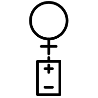
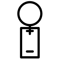
Vote On This Pornoglyph
I came up with these two designs for the “Sex Toys” Pornoglyph, but neither Shara or I can decide which one is cooler; so I’m asking for your help. I don’t want to get into a poll, just post a comment here to let me know which one you think is better, and whichever has the most votes in two weeks will get rendered as the final symbol.


I think that version 1 seems a little more clear because it’s a person and the other object is distinctly a battery 🙂
I agree with Milagros though personally I’m not a big fan of either…
Version 2. It’s sneakier, I like the overlap.
I believe that version 2 has an androgyny that would account for the male sex toy as well as the female’s.
Brevity is the soul of wit, and that is also so for graphics. For that reason, version 2 is cooler.
#2 definitely.
I prefer the first, myself.
number 2 for sure.
#1
Version 1 clearly indicates a separate mechanism.
Version #1 has a cleaner appearance(aesthetically). Not that you were going for clean. Version #2 looks like a more modern, and therefore eroded version of #1. Kind of like the difference between pictograph and alphabet. #1 Hieroglyphics vs #2 Kanji.
I like the first Glyph.
I want to get a Tshirt of the Glyph Giving Head!!
Were & When & How do I get one?
Did you ever think of one for a “CockSmith” ?
That would be a great one too.
I’m actually working on getting a T-shirt store set up right now through Cafe Press. I should have it done in the next couple weeks, and when it opens all the pornoglyph designs will be available 🙂
# 2 Without a doubt.
I like the first one. Definitely clear as to the message.
Definitely No. one.